Data visualization research helped guide a redesign to make long-term forecasts easier to understand
The National Oceanic and Atmospheric Administration’s Climate Prediction Center (CPC) launched a new look and feel to some of their long-range U.S. temperature and precipitation forecast maps on September 15, 2021. As part of the National Weather Service’s suite of official forecast products, these maps are widely used by weather forecasters, media outlets and decision-makers whose industries rely on accurate weather information.

The redesign provides higher image quality and presents weather and climate outlooks in a less confusing, more user-friendly format.
“These are maps that haven’t changed in a long time,” said Michael Gerst, an associate research professor at the University of Maryland’s Earth System Science Interdisciplinary Center (ESSIC). “As the federal government’s official forecasts for temperature and precipitation over the next one to two weeks and the coming season, a lot of people see these maps, and a change isn’t taken lightly.”
Gerst is the lead author of a research study that underpins these forecast design changes. In 2017, the CPC embarked on an effort to identify and diagnose potential problems with readability and understandability in its outlook maps and teamed up with Gerst and other collaborators from ESSIC’s Cooperative Institute for Satellite Earth System Studies to analyze forecast maps and look for ways to improve their potential to clearly communicate long-term forecasts.
“After considerable research and collaboration with partners and users, we are pleased to offer these now-operational upgraded climate outlook maps for our partners and the public,” said Jon Gottschalck, Chief Operational Prediction Branch for CPC. “Since our efforts on this project began in 2017, our team at CPC has worked collaboratively and creatively to deliver these newly-visualized maps to our stakeholders.”
Gerst and his colleagues evaluated the 6-10 day, 8-14 day, monthly and seasonal outlook maps. The team incorporated comments from map user focus groups along with guidelines from data visualization science that are based on an understanding of how users perceive and interpret images.
“Our results showed that there were some features of the original maps that people found really confusing. Visualization science theory predicted these would be the most challenging to understand, which points to the theory’s practical utility for making good designs” Gerst said.
Gerst and his colleagues adjusted the design of the old maps and compared the usability of the new versions with the original maps by surveying a group of volunteer test users. The users represented members of the general public and four targeted sectors that rely on accurate weather information including agriculture, emergency management, water resources and energy.

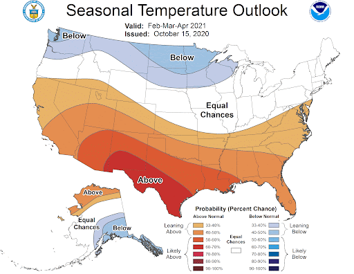
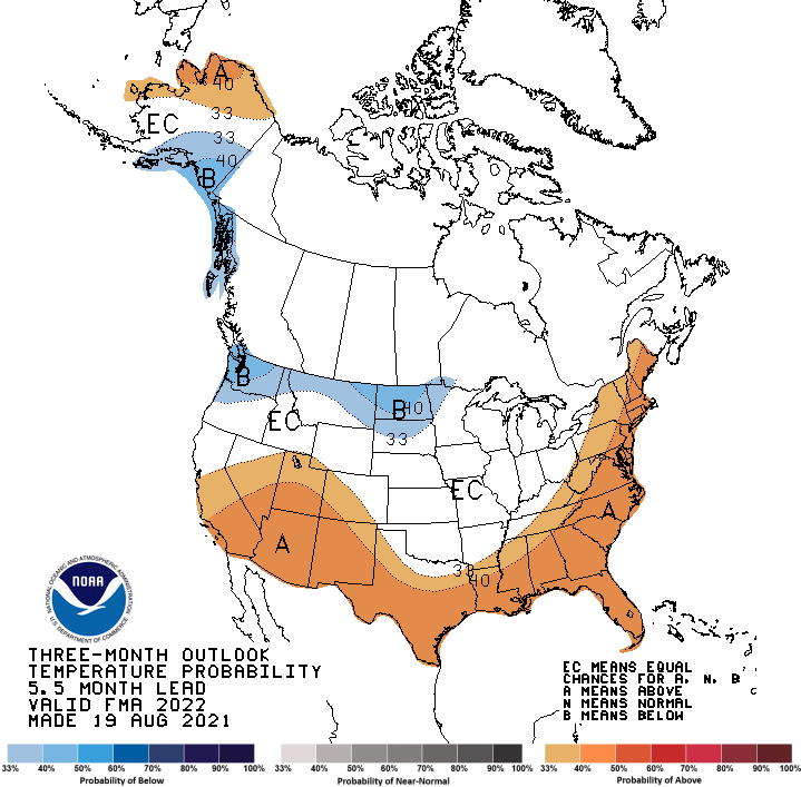
The results of the surveys shaped the final redesign. One of the most significant changes included removing Canada from the image and depicting Alaska on its own beside the continental U.S. In the original maps, Canada had been included to show physical connection between the continental U.S. and Alaska, but no data was present on the Canadian portion of the map. The study showed this to be ambiguous and confusing.
In addition, new fonts, a less ambiguous representation of forecast probability scales and a clearer, more user-friendly legend make the new version cleaner and less cluttered.
CPC says these maps are just the first to get a new look. More maps from the NWS suite of forecasting products will be getting a visual upgrade in the coming years.
###
This story was adapted from text provided by the Climate Prediction Center.
Additional UMD authors on the study include ESSIC visiting associate research professor Melissa Kenney, PhD candidate in geographical sciences Allison Baer (B.S. ’15, environmental science and policy), Amanda Speciale (B.S. ’19, environmental science and policy) and faculty assistant J. Felix Wolfinger.
This research was supported by the NOAA Climate Prediction Center (Award No. NA14NES4320003). This story does not necessarily reflect the views of this organization.
The research paper, Using Visualization Science to Improve Expert and Public Understanding of Probabilistic Temperature and Precipitation Outlooks, was published in the journal Weather Climate and Society in January 2020.
Media Relations Contact: Kimbra Cutlip, 301-405-9463, kcutlip@umd.edu
University of Maryland
College of Computer, Mathematical, and Natural Sciences
2300 Symons Hall
College Park, Md. 20742
www.cmns.umd.edu
@UMDscience
About the College of Computer, Mathematical, and Natural Sciences
The College of Computer, Mathematical, and Natural Sciences at the University of Maryland educates more than 9,000 future scientific leaders in its undergraduate and graduate programs each year. The college’s 10 departments and more than a dozen interdisciplinary research centers foster scientific discovery with annual sponsored research funding exceeding $200 million.Date: Thursday, September 16, 2021


